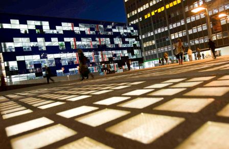
The Image grid content type provides the opportunity to add groups of images to pages. See the example below.
The Image grid is recommended for standard content pages, but can be used on landing pages. At desktop screen width it displays in rows of four on landing pages, and in rows of three on standard content pages. Each image contains a picture, caption with the option to make the image a link. The first three images are not linked and the second three images (lion, I-HUB and the railings) are.
Image grid widget

Faculty Building

Dalby Court at night

Faculty Building at night

I-HUB White City Campus
Instructions
Similar to other content types like Accordions, Slideshows and People Lists, an Image grid consists of a hidden folder where you add your image grid items and a widget on the page which displays those items.
Step one: create the correct folder structure and add your image grid items
1. Add a hidden sub-section called ImageGrid (case sensitive) directly beneath the section where you'd like the Image grid to appear (it's a hidden repository folder and so the 'Show in navigation' option needs to be unticked).
2. Add a second hidden sub-section below your new ImageGrid sub-section. You can name this sub-section as you wish. In my example I've called the sub-section: Sample images.

3. Navigate to your second sub-section (in my example Sample images), Click the blue Actions button and select Create content.
4. Add an Image grid item content type for each separate image in your set. (Find out how to add a content type to a section),
5. Fill in the form as instructed below:
| Field title | What should I do? | Is it compulsory? |
|---|---|---|
| Name* |
Give your items a name, e.g. 'A - My first image; B - My second image' etc. This is for you and your colleagues reference only. Your users never see it. For example, the first item should be named: A - My first item, the second item B - My second item, and the third: C - Third item; and so on. If you need more than 26 items in an accordion, name them A - ; AA - ; B - ; BB - ; and so on... |
Yes |
| New Image* |
Click Select media to choose a image from the Media Library or to upload a new image. An image of 3000 pixels (wide) by 2000 pixels (high) is required for this content type. Please view the guidance on adding and selecting images in the Media Library. If you add an image you must add an 'Alt text' describing what is contained in the image. This is an accessibility requirement. |
Yes |
| Internal Link | YOU MUST ADD A LINK or this item won't display If the link is internal (Internal means from one t4 section/page to another t4 section/page), click the Add section link and choose the section/page from the complete list of sections in t4. |
No |
| External Link | Or If the link is external (External means any page not in t4, either within the College or elsewhere) type or paste the entire URL including http:// or https:// e.g. https://www.bbc.co.uk/. | No |
| Media Library Link | Or add a document (pdf, Word, Powerpoint etc.,) from the Media Library | No |
| Caption* | This appears underneath the image | Yes |
| Display items* | This defaults to yes | Yes |
6. Click Save and approve.
Repeat steps 4-6 for each image grid item you want to add.
Step two: add the Image grid widget to the page where it will display
1. Add a Image grid widget content type to the page where you want the Image grid to appear. (Find out how to add a content type to a section).
2. Fill in the options as required (see table below).
| Field title | What should I do? | Is it compulsory? |
|---|---|---|
| Name* | This is the behind-the-scenes name, only visible to editors of the section | Yes |
| Block title* | This title will be shown above the entire block, if switched on with the field below. Otherwise it will be an 'invisible' screenreader only heading and will ensure your page has and H2 | Yes |
| Show block title? | Ticking this box will make the heading show to all users, not just screenreaders. | No |
| Find items* | Click Add section link and navigate to the sub-folder where your Image grid items live. In my example this is Sample images | Yes |
| Display items* | Defaults to Yes. | Yes |
3. Click Save and approve to save the widget.

